Website History
Navigate each year of our website with the timeline below

2006
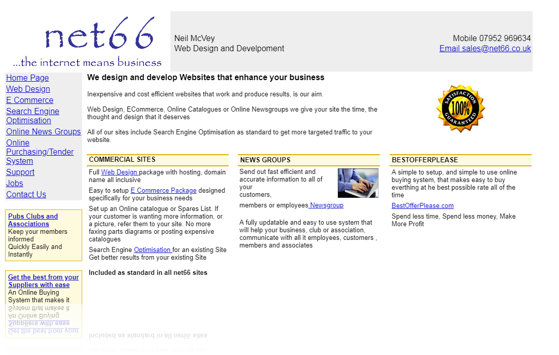
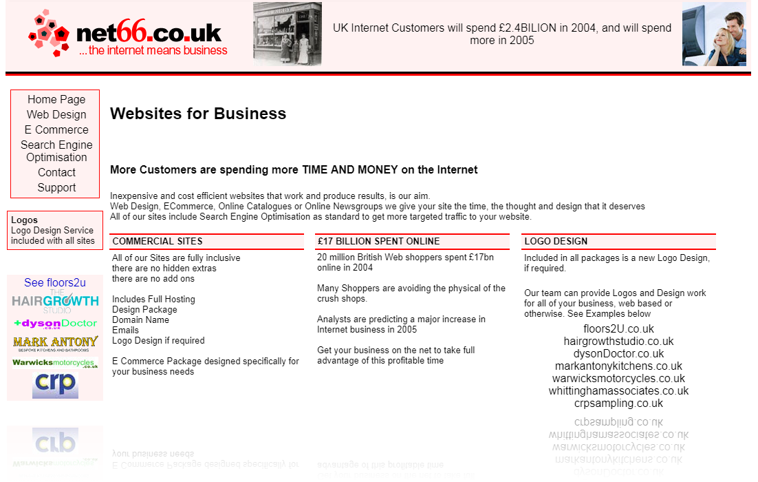
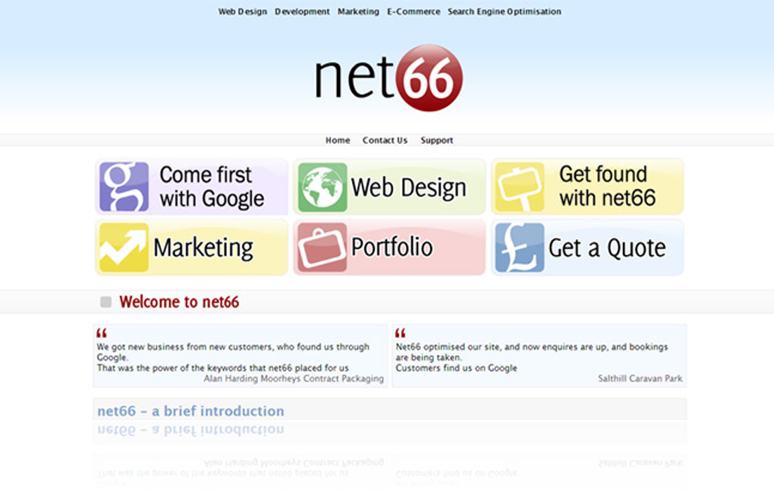
What a difference a year makes. With the advent of CSS, the design aspect of websites changes almost overnight. Looking at this colourful website below you can see just how much of an advancement to websites CSS was. We liked this theme so much that it’s still in employment today on our net66.ie site.

2007
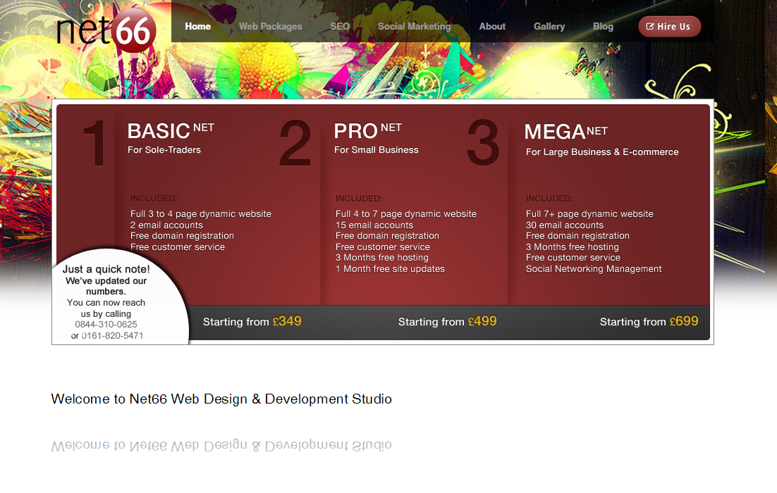
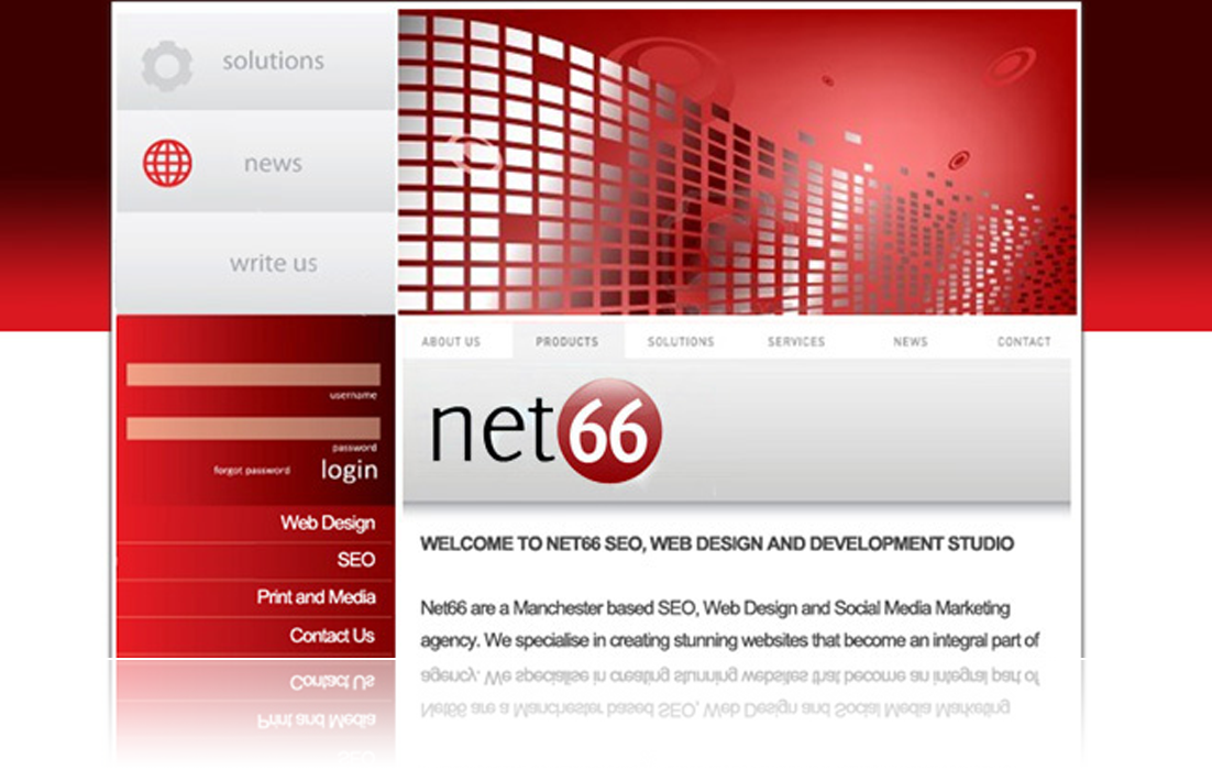
One of our first implementations of our slider, this Net66 site is arguably our most experimental website. Now choosing red as our prominent colour, this was the also the first time we offered a log in to our website for clients. Enabling them to contact us 24 hours a day. This custom built login system was created using the latest in PHP, leading the way for custom built functions.

2008
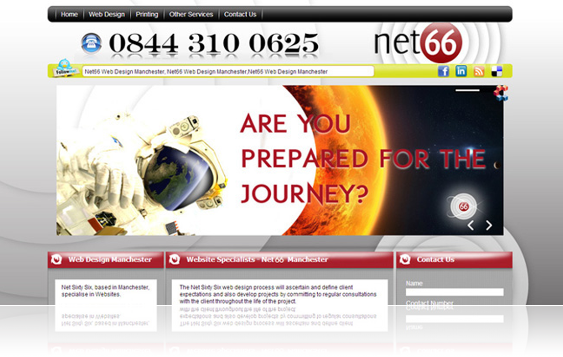
As sliders became increasingly more popular, for this site we focused a lot more detail on the slider. Employing 3D transitions, we stayed at the forefront of Web Design. 2008 also brought the advent of Social Media with us displaying several links to our Social Media profiles, as well as utilising Twitter’s API to add a ticker of our latest tweets to our site.

2010
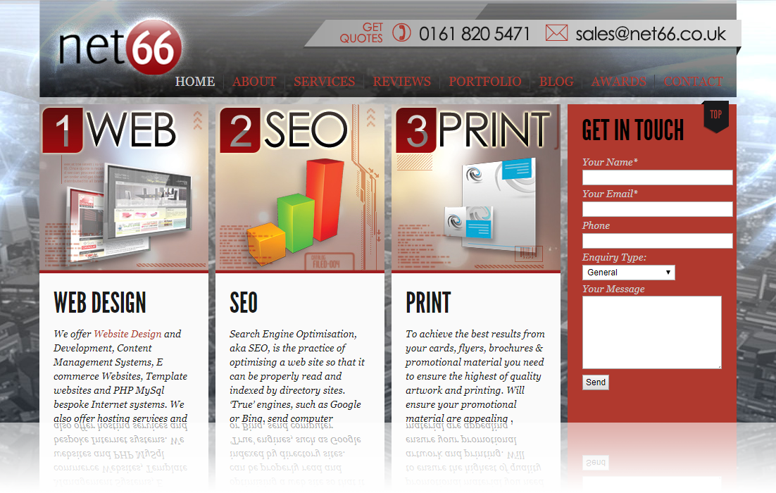
With minimalistic website catching on, we employing simplistic themes throughout our website, most noticeably on the sidebars. After the previous website we switched to a slider that still featured prominently, but was not full width. This made it easier for clients to contact us with the new contact form seen on the right. The slider itself ran in Javascript enabling us to choose from a wide array of the most modern transitions.

2011
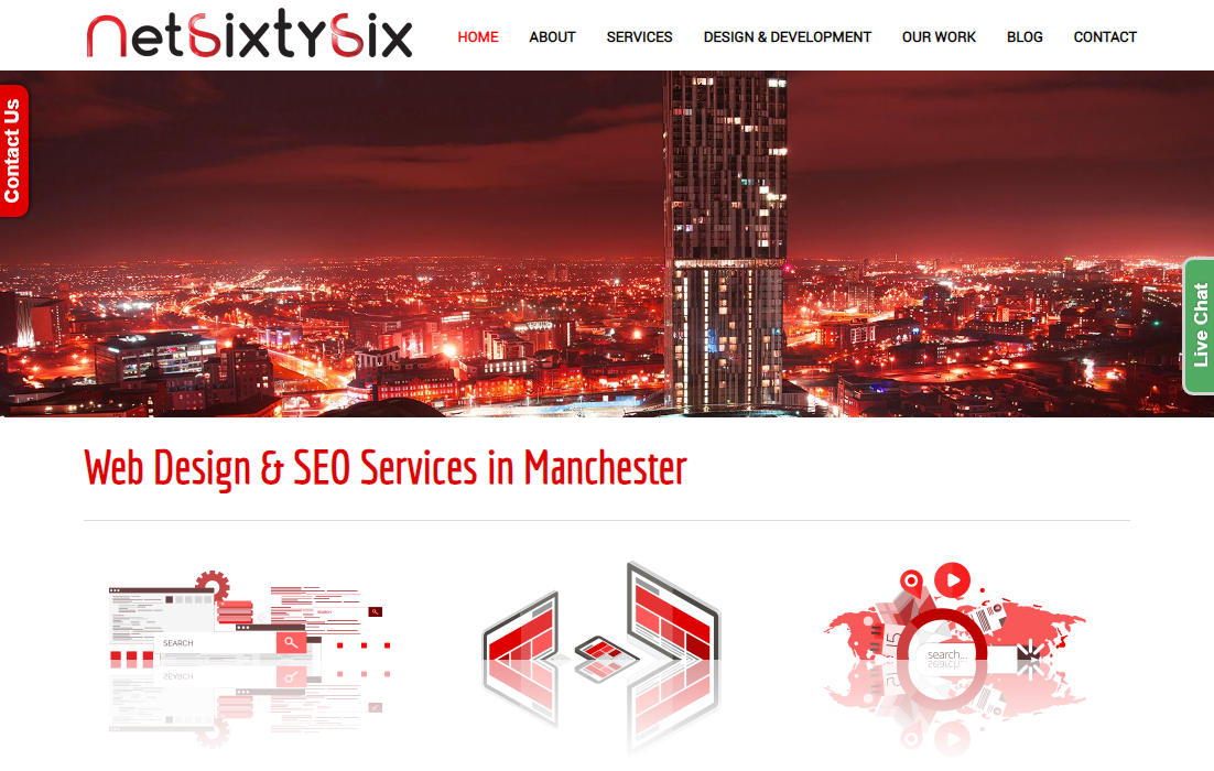
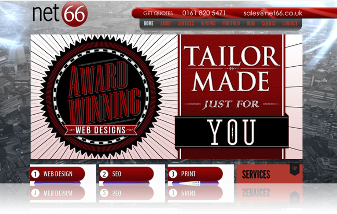
Going back to our red roots, Net66 redesigned the menu on this side and also customised our previous slider to make it full width. We also redesigned the three boxes shown on the home page updated their images in line with the latest trends. We also re-worked the sidebar on this website using the latest PHP functions to create another bespoke login system.

2012
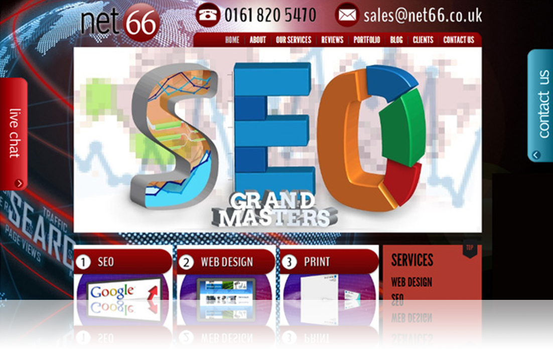
Apart from a few design changes, most notably the background and menu, Net66 pushed the boat out and created our own Live Chat function. Using complex Javascript we ensured that you could connect with a live person whenever a staff member was available. We mimicked the pop out function of the live chat box and created a custom contact pop out so that we were only ever a click away.

2013
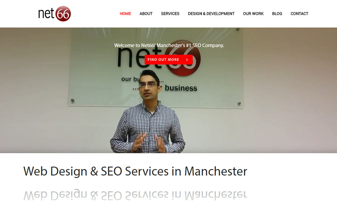
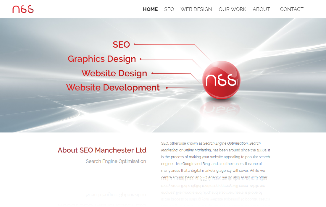
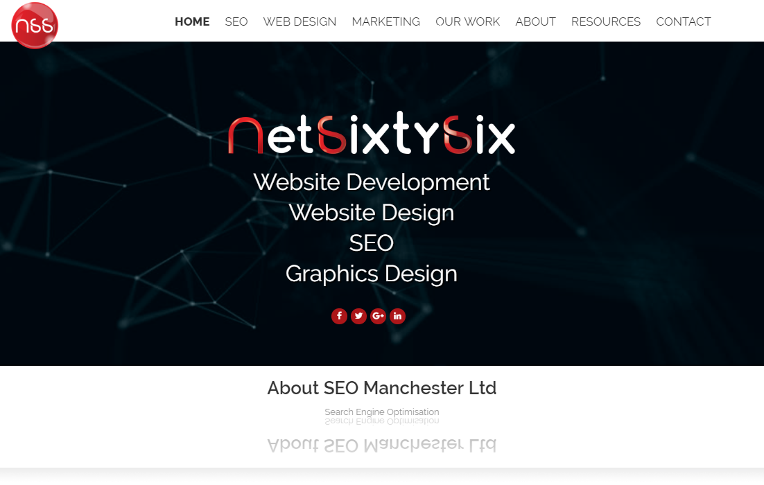
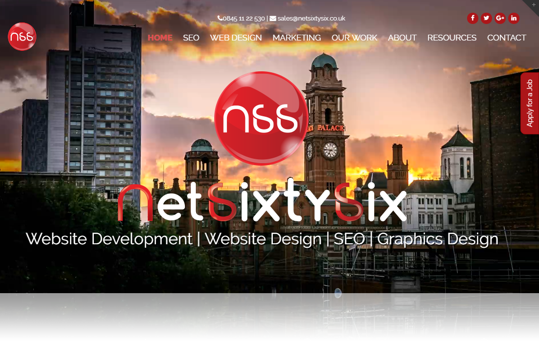
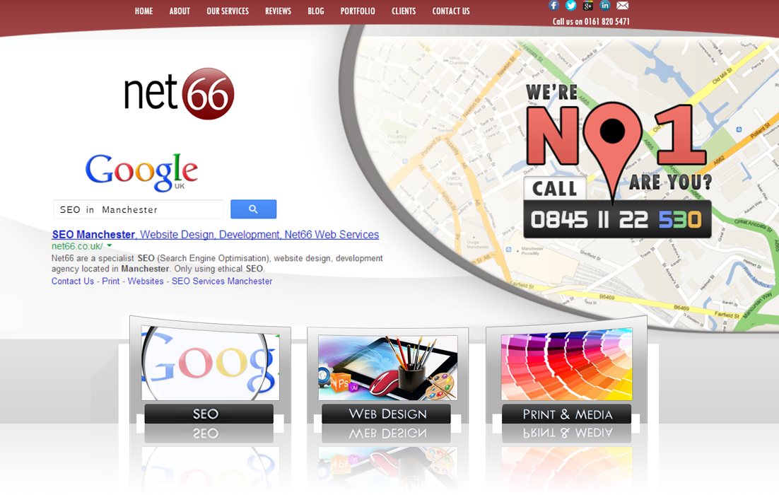
2013 saw a complete redesign of the website into what you can see below. We went for softer tones of red around the site as well as a much larger, featured slider.
Rather than having a separate menu box down the right hand side, this was removed to allow more space for our main service boxes to advertise our SEO, Web Design and Print & Media services.

