
Google AdWords have long been the scourge of the SEO profession. You can work your butt off for weeks and months and once you’ve reached that hallowed number one spot, you can still be pushed down a few places by Google’s Adwords. Meaning no matter your strengths at SEO, anyone with a large budget can still be placed above you.
However there are quite a few statistics that show people aren’t as keen to use these sponsored placements and will instead choose to ignore them and focus on the organic listings. Naturally I do this myself as I know the work that’s gone into those rankings.
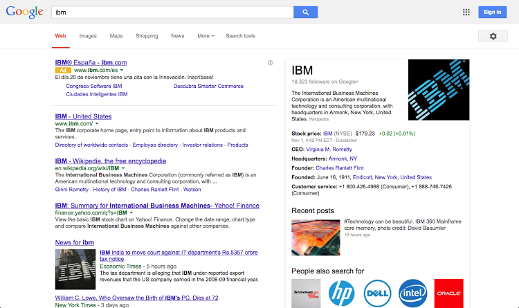
Traditionally, Adwords have always been separated from the organic listings by a champagne coloured box that surrounds them. They also have a title informing you that they are indeed advertisements and they are there as they’re related to the keywords you’ve searched.
At one point Google trialled a grey box instead of the previous champagne but many argued it blended to easily into the background of the site. Google reinstated the champagne box shortly after.
They’re experimenting again it seems, but this time rather than change the colour, they’ve done away with the background entirely. They’re now leading towards the mobile look. Rather than a completely different background, they’re going with a subtle, but more brightly coloured box that is just under the title of the advertisement. They’ve also sort of underlined the advert which seems to bring it more prominently to the users attention. See an example below (Courtesy of All Google Testing):
What do you think of the new adverts?
Blog Post by: Greg McVey