
So this morning I arrived at the office nice and early, I had my porridge, I had my brew (Coffee, white, one) and there was even a good song on the radio. I started cycling through the Social Media accounts checking for new follow, tweets, likes, posts, +1s etc. But when I got to Google+ I was hit by a wave of confusion and confronted with this:
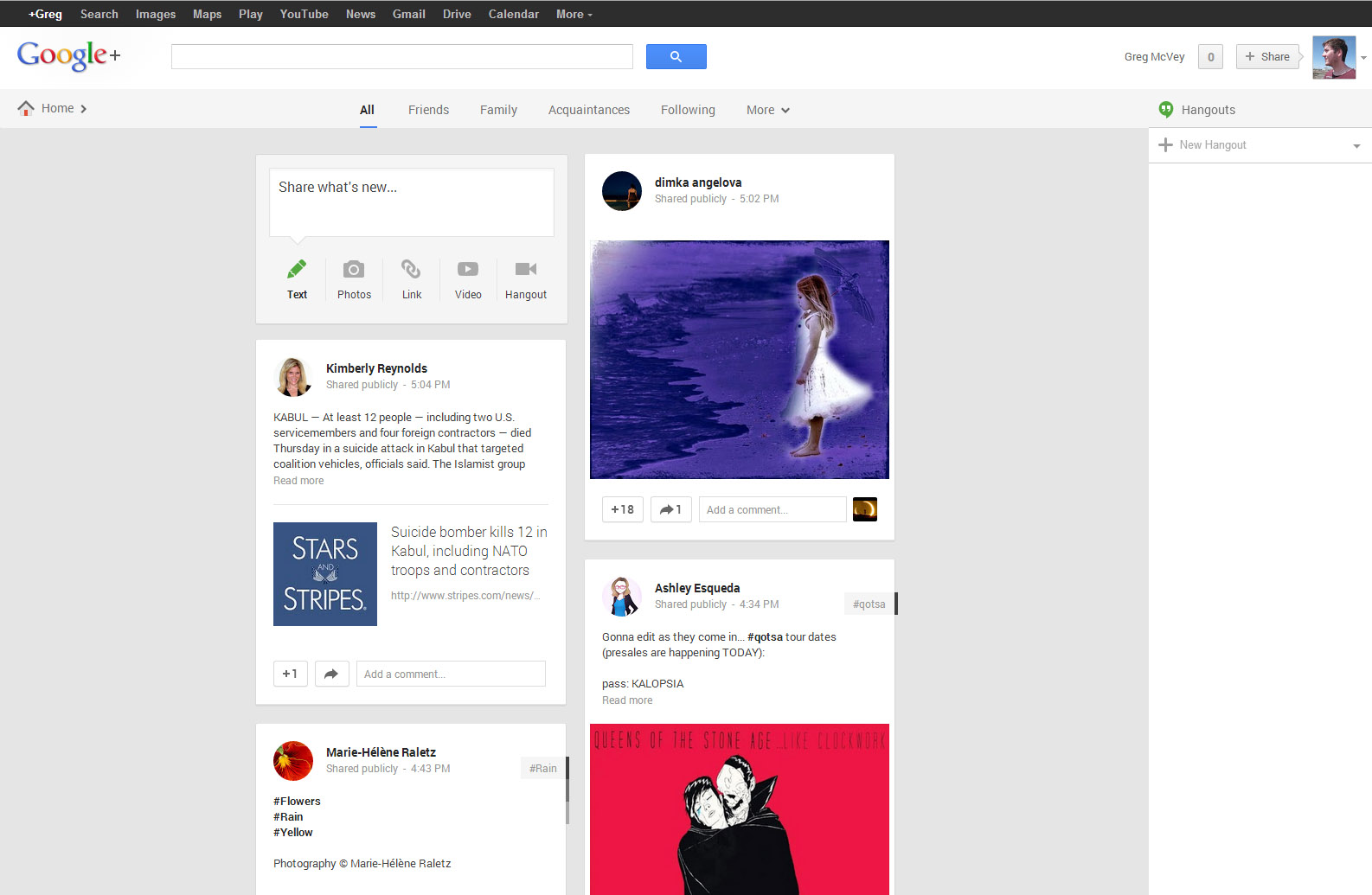
“But I’ve just checked Pinterest” I thought. Clearly this coffee isn’t working. I loaded it up again and was greeted with the same layout. Then it hit me that this was actually Google Plus and not Pinterest. Incredible, whilst not exactly a carbon copy of Pinterest, the design does seem to lend heavily from the infinite scroll, tiled panel design that was first introduced by the big P.
My first impression was, if it’s a toss up between this layout and the previous layout, it’s completely on par. I’m not championing the previous design, but neither am I shouting about this new design from the rooftops. However, after a couple of minutes of playing around with it, the news feed decided to finally respond to my browser and screen size and include a third column. I know it’s only a small thing, but it just seemed to make the whole thing sit together nicely.
Then there was the discovery of full width images spanning the width of the page and that really helped me warm towards the new news feed.
After my fill of the home page I went to my profile and was greeted by the biggest cover photo in the world. Check it out:
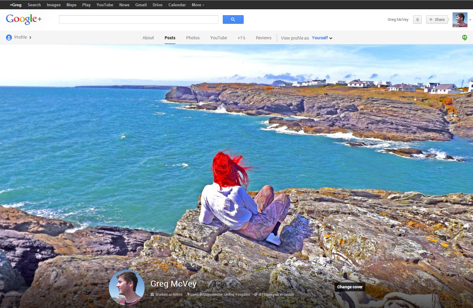
Pretty big. The rest of the profile panned out into all my latest updates spread over 3 columns. I’ve got to admit as well, the three column layout is brilliant. You add your updates in the very top left box which, as humans read from top left to bottom right, is perfectly placed. As opposed to Facebook where you’re made to add updates from the top of your news feed. A slight advantage to Google+ but an advantage nonetheless.
All in all I’d say Google has done a really great job with this. It looks like Google may have realised that it might never cater to everyone’s requirements for a Social Media platform, so it’s adapted to improve UX for the current clientele. After all Google+ is far more geared towards photo sharing than Facebook is.
Have you experienced the New Google+ yet? What do you think?
Blog Post by: Greg McVey