
In the midst of my usual ritual of getting into work, making a coffee, eyeing a few emails and checking social media, I logged on to Facebook and was met with the screenshot below:
Bookmarks, Ticker and Chat
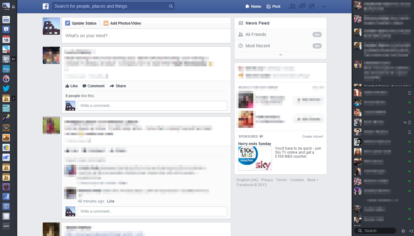
As you can see it’s a pretty radical change from the news feed we know and are used to. The most obvious changes are to the lateral areas of the page. On the left hand side where you were presented with your favourites, pages, apps and a nice big link to your profile, these have all now changed into what Facebook are calling Bookmarks. They’re presented in a smaller format looking more like App Tiles you get on your phone than links you’re presented with on a desktop platform. The “Ticker” and chat options on the right hand side are functioning the same but, as with the new bookmarks, the background colour has changed from the traditional Facebook light blue/white to the darker colour more associated with the mobile app. A stark change then.
You can still access the breakdown into favourites, pages, apps etc when you go to the very bottom of the Bookmarks list and click the icon with the three dots on it. This opens a little pop-out page which will seem more familiar to you.
News Feed and Options
What next jumped out at me was the size of the actual stories in the news feed. They’re huge and now definitely seem to be the main Feature of the site. Looking back at the previous news feed design, it seems so cramped and busy and I’m instantly warming to the new news feed.
As you scroll down your stories as well, the boxes on the right hand side of the page remain absolute and follow you down the page. I’m presuming this is so that Facebook can still serve advertisements to you, but as the news feed stories are now so large, you won’t begrudge them the space.
You also have much more control over what appears in your news feed with the use of the box in the top right hand corner. You can choose from your regular News Feed (usually customised), all friends, most recent stories, following, groups and even the latest photos, games, music and your custom lists. This makes it so much easier to switch between your different feeds as the previous Facebook only had the option to change between Most Recent and Top Stories.
Toolbar
The toolbar has also been given a nice little revamp. See below for a closer look:
![]()
Rather than the flat single colour of the previous toolbar, a gradient has been added. Whilst this is hardly the most taxing of changes, it does add a certain depth to the new toolbar. Especially considering that the background for the search box is now a dark blue colour as opposed to its previous white. The old Facebook logo that was in the top left that redirected you back to the home page has been changed to a simplistic tile, again like the bookmarks option, minimalising options on page.
To the right of the search box and logo you can also see the redesigned Home and Post options along with the notifications for friend requests, messages, notifications and a brilliant little “settings” tab. The reason I prefer this settings tab is that the first option you’re greeted with on clicking it, is to quickly switch between the identities of the Facebook pages you manage and your profile.
A good thing is having the “Post” button on the toolbar now so you can post anytime. I also have to say that this new toolbar looks eerily similar to Twitter’s toolbar.
I’ve uploaded more screenshots of the new Facebook below, feel free to check them out:
Blog Post by: Greg McVey