
Gone are the days where you have to navigate to 2 different websites in order to find out how quick and how mobile friendly your website is. Google have recently launched a new tool where users can enter their website address and get the page speed and mobile friendliness score all on the same page. The report is simply a combination of the page speed insights and the mobile friendly testing tool; Continue reading “Google Announce New Tool Which Tests Your Website Mobile Friendliness and Page Speed.”
Net66 says: ‘Prepare for Penguin’
Only 24 indexing days till Christmas – and 31 till 2016

Winter has come to Manchester courtesy of Storm Clodagh. For December, it is usually colder in these parts, but the weather has been more autumnal. This apart from 80 mph winds in nearby Rochdale and Denton and heavy rain throughout the UK. At this moment, too warm for seeing penguins in Albert Square, yet Olaf and Elsa managed to appear in Stalybridge (but that was for a Christmas lights switch-on). Continue reading “Net66 says: ‘Prepare for Penguin’”
Net66 Would Like to Thank Our Client
Net66 like to be there for our clients and strive to go above and beyond what “traditional companies” would do. We never ask for anything in return other than a continued business relationship.
That’s why it’s always nice when we receive something back from our clients. The Space Collective have been working with Net66 for years now and enjoy a great relationship with ourselves. We’ve presided over the rebuild of two of their websites and successfully optimise both of them. Continue reading “Net66 Would Like to Thank Our Client”
Net66: Google Releases Festive Search Bars
Google LOVES a doodle, and this year it looks like they’re not letting the chance to throw one out there get away. They’ve already released a feature rich Santa Tracker, and now they’ve updated their search bars for queries relating to Christmas, Kwanzaa and Hanukkah (Chanukkah).
These bars are triggered when either of the seasons festivals are included in a search string. Check them out below of search for yourself. [Christmas] [Hanukkah] [Kwanzaa] Continue reading “Net66: Google Releases Festive Search Bars”
New Google Easter Egg Responds to Hodor!
Hodor is a character from the ubiquitously popular book series A Song of Ice and Fire and TV series A Game Of Thrones. Hodor is a character who, much like a Pokemon, can only say Hodor. Everyone refers to Hodor as Hodor, even though his actual name is Walder.
In recognition of this character, Google have released a little Easter Egg celebrating the popularity of Hodor’s speech. Simply type or talk “Hodor” into your Google browser and you’ll get a response from the man himself. Check it out:
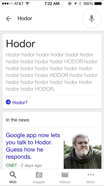
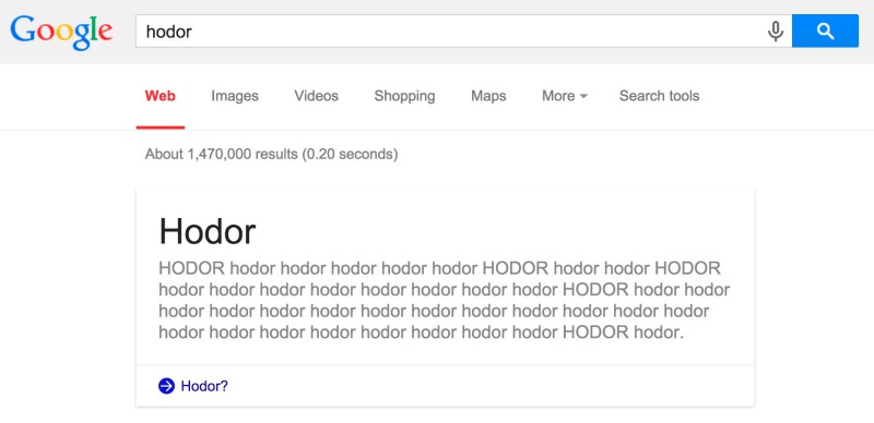
Are you a fan of this new Easter Egg from Google? For all you web developers out there, here’s a bonus Hodor Ipsum Generator.
Blog Post by: Greg McVey
Net66: 40 Extra Creative Logos with Easter Eggs [Infographic]
Branding is often one of the most important decision a business will make when launching. Especially when it comes to the Logo. As a business, your logo is what is going to be synonymous with your business.
It’ll be the first thing that comes to your customers’ heads when they think of your company so you need to make it special. And there are a lot of companies out there with very lovely logos. What can sometimes take your logo to the next level is having a deeper meaning to it.
An extra little slice of flair could help your business launch with an extra few rocket boosters. Take a look at 40 logos that have a little something extra than what you can first see.
Which one is your favourite?
Blog Post by: Greg McVey
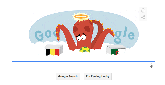
Net66: Google Celebrates The Life and Times of Paul The Octopus
Paul The Octopus is a creature of lore when it comes to the world cup. At the 2010 World Cup, Paul the Octopus correctly predicted the result of all 7 of Germany’s World Cup Games.
Sadly Paul passed away in 2010, presumably from all the excitement. Take a look at Google’s homage to Paul below:
Blog Post by: Greg McVey
Net66: Infographics and Their Benefits
Everyone loves an infographic. They’re fun, usually colourful and pretty damn useful. Here are the top six benefits to having one:
> They’re so much more attention grabbing than regular images. Usually entailing a large, colourful banner at the top with a big, bold heading, users are drawn in by this.
> Attention spans. They’re getting shorter in the wake of the content marketing revolution which has, hey, HEY, LOOK AT ME!! If you looked at this straight away you can see what I mean. People need information in short, sharp bursts and that’s exactly what infographics do. As this information is usually surrounded by bright colours, this helps us remember what we’ve read too.
> They’re more viral. They get everywhere. This is as much down to the fact that they usually have an embed code in them, as it is down to the shareability of them. Would you copy and paste text to someone you know might like it? No you’d hit the share button and share the whole blog. With infographics they come with their own share button to make this so much easier for you, as well as making it easier for it to go viral.
> They can also help with brand awareness. If your logo and website match a colour scheme, an infographic can use those same colours to raise the profile of your brand on the web.
So if you’re looking to create some powerful content on your website, use an inforgraphic and see how well it goes for you.
Blog Post by Greg McVey
Net66 SEO: How to Make a Speedy Website
In SEO and in life, people are looking to go faster at every opportunity. It’s the same with websites. Look at how highly anticipated the 4G rollout was and you can understand people’s need for speed. If your website loads quicker then you’re less likely to frustrate your end user. This could keep quite a lot of traffic on your site. So see below for our tips on how to speed up your site.
Update Your Website. For example, if you’re using WordPress, new updates are constantly made to the platform and to plugins, themes etc. So if you’re still using and older version of a plugin or the framework, then not only will your website note be as quick as more recent websites, but it could also have security holes in it. Updating this will help speed up your site’s loading time as it improves on the basic framework your site had. Note: If you do decide to update anything. ALWAYS take a back up. You never know.
Limit Plugin Use. I know from experience that plugins range from the incredibly useful, to the just plain awesome category. But there is always the temptation to build and build your arsenal of plugins until your site starts to struggle. Too much of a good think don’t you know. So make sure you’re using only the plugins that are essential for your site to run. Deactivate the ones you aren’t using. But again, check with your developer before you de-activate any plugins as some might be imperative to the but might not seem it at first glance.
Optimise images. So it’s great that you’ve finally had your store/products/portfolio professionally photographed. But now you’ve received the files you’ll find that they’re nearly 5mb each. Using these images off the bat would be a bad idea. They’re large files and as such, will take a long time to load on your site. Make sure you crop/resize them before you add them to your website. Otherwise you’ll find yourself waiting and age before you get to see your shop/products/portfolio online in all its glory.
Blog Post by Greg McVey
Net66: Google Now Providing Web Design Tools
This week Google have launched their own HTML5 website design tool. Although in Beta at the moment, it already looks like a pretty handy tool. You can download it here. It seems the reason Google are now releasing this tool is down to the fact that, although a wonderful language, HTML5 has yet to be adopted and used in everyday web design.
One of the reasons for this is that you have to design three websites in effect. One for computers, one for tablets, and one for phones. The web design tool released by Google looks to tackle this problem head on with it’s easy and simple to use interface. Check out the demo below:
Blog Post by: Greg McVey
Net66 Web Design: Designing a Mobile Site – Top Tips
As a business owner you need to keep up to date with every aspect of your business, and that includes the website. Now a lot of us aren’t tech savvy, much in the same way us “computer geeks” aren’t social savvy. So here’s some top tips to help you not only understand mobile design, but also how to have an input in the design process too:
Keep it Simple
The mobile experience, although immersive in it’s own right, can get bogged down by too much content. A mobile device’s screen is a lot smaller than even the smallest netbook. So if you’ve a 500 word, graphic rich, video inclusive home page, a mobile device will take it’s time to load all of this content. So keep it simple. An image here or there isn’t too bad, you also don’t want reams of text, as users will struggle to read it all on a small device.
Ensure Compatibility
iPads, iPhones, Adroids, Tablets and now Smart Watches. Each device released makes it harder for one website to do it all. Even with the ubiquitous iPhone, with each new release comes a new screen to fit your website to. So you need to make sure your website is looking how you want it on a range of devices.
Responsive Web Design
This type of design is designed to respond to the size of the browser width that you’re viewing it through. This ties in with the second point as a responsive website can usually respond to a range of different mobile device screens. More than that though, if you’re on your computer and choose to shrink the size of your browser window, the website will respond to that straight away. So you can still view all the content of your favourite website, but whilst also having another window open.
Full Website Option
Some people are quite averse to mobile websites and would prefer to view the website in full. So make sure you always include this option.
Follow these tips and if ever you want a mobile website designed, you’ll have a head start on what to do.
Blog Post by: Greg McVey
Net66 Google: Google Launches New Card Layout for Mobile Search
Web Design has progressed a lot over the years and it seems to be the current trend is to just simplify everything. We’ve seen that most recently with Google’s redesigned logo. This has lead to a lot of companies now redesigning their own websites with simplicity in mind.
Google is again rolling out their interpretation of the simple design by introducing a new layout for their Mobile search. Known as a card layout, this design segments different areas of the website and displays them floating apart from each other, over a static background.
This has previously been introduced on Google+ and it’s also similar to Facebook’s recent timeline update. But now it seems to be the turn of the Google Search Results themselves. You can see a screenshot below of what the new Card Layout looks like on the iPad:
 I really quite like the new design. I’m also comfortable saying it’d work just as well and look just as nice on your computer. What do you think to the new Layout?
Net66 SEO: The Best Web Design Tips for SEO
Website Navigation
Navigation is one of the most important factors that needs to be considered when building a new website. Your menu bar opens the whole of your website up to your visitors so needs to be as clear, concise and easy to use as it can be. When Designing your menu bar you need to make sure that it is both search-engine and user friendly. This way the structure of your menu will help boost your rankings, and when visitors arrive on your website, your menu can make your user’s visit a pleasant experience. The user will be richer for the experience and be more likely to visit you again to purchase an item or service.
URLs
Your root domain and all subsequent pages are highly important to your website’s performance in the Search Engines as well as User experience. For example, which URL would you be more likely to click on:
https://netsixtysix.co.uk/internet-marketing/ or https://netsixtysix.co.uk/?pageid=188 ??
You’d click on the link you understand, of course you would. Page Id 188 holds no meaning for you so you may not wish to click it as it could be misleading.
Images
Images do matter in SEO and humans need to be swayed by good looking images. Here are the main points in optimising images:
- Alt Tag everything. Traditional spiders have eight eyes, Google’s spider has none. So you need to describe your images to Google otherwise it wont know what it’s looking at or even if it’s relevant to your site or keywords.
- Optimise for speed. Everyone do loves quality these days but having a 300 dpi images thousands of pixels wide on your site is going to take a long time to load. Users get bored easily these days so a quicker load time = more engagement. Google know’s this and is likely to give you a boost if you have a quicker site.
Follow these tips and you should have a great website to work with from the off of your SEO Campaign.
Net66 News: Facebook Gets a new Facelift – News Feed Redesign
In the midst of my usual ritual of getting into work, making a coffee, eyeing a few emails and checking social media, I logged on to Facebook and was met with the screenshot below:
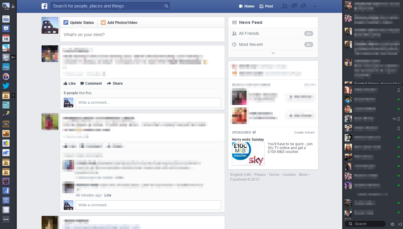
Bookmarks, Ticker and Chat
As you can see it’s a pretty radical change from the news feed we know and are used to. The most obvious changes are to the lateral areas of the page. On the left hand side where you were presented with your favourites, pages, apps and a nice big link to your profile, these have all now changed into what Facebook are calling Bookmarks. They’re presented in a smaller format looking more like App Tiles you get on your phone than links you’re presented with on a desktop platform. The “Ticker” and chat options on the right hand side are functioning the same but, as with the new bookmarks, the background colour has changed from the traditional Facebook light blue/white to the darker colour more associated with the mobile app. A stark change then.
You can still access the breakdown into favourites, pages, apps etc when you go to the very bottom of the Bookmarks list and click the icon with the three dots on it. This opens a little pop-out page which will seem more familiar to you.
News Feed and Options
What next jumped out at me was the size of the actual stories in the news feed. They’re huge and now definitely seem to be the main Feature of the site. Looking back at the previous news feed design, it seems so cramped and busy and I’m instantly warming to the new news feed.
As you scroll down your stories as well, the boxes on the right hand side of the page remain absolute and follow you down the page. I’m presuming this is so that Facebook can still serve advertisements to you, but as the news feed stories are now so large, you won’t begrudge them the space.
You also have much more control over what appears in your news feed with the use of the box in the top right hand corner. You can choose from your regular News Feed (usually customised), all friends, most recent stories, following, groups and even the latest photos, games, music and your custom lists. This makes it so much easier to switch between your different feeds as the previous Facebook only had the option to change between Most Recent and Top Stories.
Toolbar
The toolbar has also been given a nice little revamp. See below for a closer look:
Rather than the flat single colour of the previous toolbar, a gradient has been added. Whilst this is hardly the most taxing of changes, it does add a certain depth to the new toolbar. Especially considering that the background for the search box is now a dark blue colour as opposed to its previous white. The old Facebook logo that was in the top left that redirected you back to the home page has been changed to a simplistic tile, again like the bookmarks option, minimalising options on page.
To the right of the search box and logo you can also see the redesigned Home and Post options along with the notifications for friend requests, messages, notifications and a brilliant little “settings” tab. The reason I prefer this settings tab is that the first option you’re greeted with on clicking it, is to quickly switch between the identities of the Facebook pages you manage and your profile.
A good thing is having the “Post” button on the toolbar now so you can post anytime. I also have to say that this new toolbar looks eerily similar to Twitter’s toolbar.
I’ve uploaded more screenshots of the new Facebook below, feel free to check them out:
Blog Post by: Greg McVey
The Evolution Of Google
If you were asked to describe to someone what Google actually does you would probably describe a search engine that we all know to be the most popular and overall, the best.
Many others have tried to copy Google over the years, and many have failed along the way. There are more than we could possibly mention but the likes of Lycos, AOL, Snap, Magellan may jog your memory.
The Latest example would be Bing (rumoured to be Because It’s Not Google). Even though Bill Gates may never publicly use those exact words, he would loved to have started Google; or even have half their market share!
So, what Has Google got that nobody else has?
What Google posses as an organisation is an understanding of its user. Google sets itself out to provide the best possible user experience. Most of Google’s competitors are aspiring to be Google. This gives Google a huge advantage because while most of its competitors are second guessing their methods, they are busy developing new products and diversifying their products and services.
Google is rumoured to be on the verge of overtaking Apple in the number of application downloads. That is now small feat as Apple has dominated that marketplace and has a very big and very loyal following.
As well as Google Play App Store we are seeing many more weird & wonderful developments from Google, not least the very controversial Google Glass.
So, do Google have competitors? You could probably make a case for both sides in all honesty because Google is so diverse in 2013 it really is hard to liken a company with the same ambition for development as Google.
The financial Times recently claimed Googles closest comparison would have been with General Electricity in the 19th Century as there domination was multifaceted and at a time where there was an age of electrification. You could argue that the age of computerisation was pretty much initiated by Microsoft, but are they in the same ball park as Google, I, and many others would think not!
The conclusion we can draw from this is Google are not to be underestimated. OK, so there is Google+, that has not yet covered Google in glory but how many times have you thought “that’ll never work” Exactly!
Is it feasible that in years to come we could all be walking around wearing Google Glasses and using the internet remotely via pair of Glasses! If Google think there is a chance we could then there is!
The great thing for us is we get to work with Google’s diverse product range on a daily basis and much like many clever will tell you:
“The more you learn, the less you know!”
Which could quite easily be the motto of Net66 because our team have a thirst for knowledge and a passion for new technologies and strategies. But are realistic enough to admit there is a lot we have to improve on.