
Ok maybe I’m being a bit cynical here, but if Google’s logo was a physical thing, it just looks like they’ve hit it with a brick. Not smashed it, just flattened it. Technically it isn’t even a “new” logo. As Google has been using it internally for years now to save on Printing costs. You can compare the two new logo’s below:
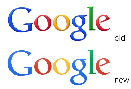
To be fair there is a noticeable difference in the colours, and it’s bang on trend with the whole minimalist approach that’s so prevalent these days. I do like it as well, it’s neat and precise.
What do you think?
Blog Post by Greg McVey
Image: Justin Sullivan/Getty Images; Ars Technica