
Web Design has progressed a lot over the years and it seems to be the current trend is to just simplify everything. We’ve seen that most recently with Google’s redesigned logo. This has lead to a lot of companies now redesigning their own websites with simplicity in mind.
Google is again rolling out their interpretation of the simple design by introducing a new layout for their Mobile search. Known as a card layout, this design segments different areas of the website and displays them floating apart from each other, over a static background.
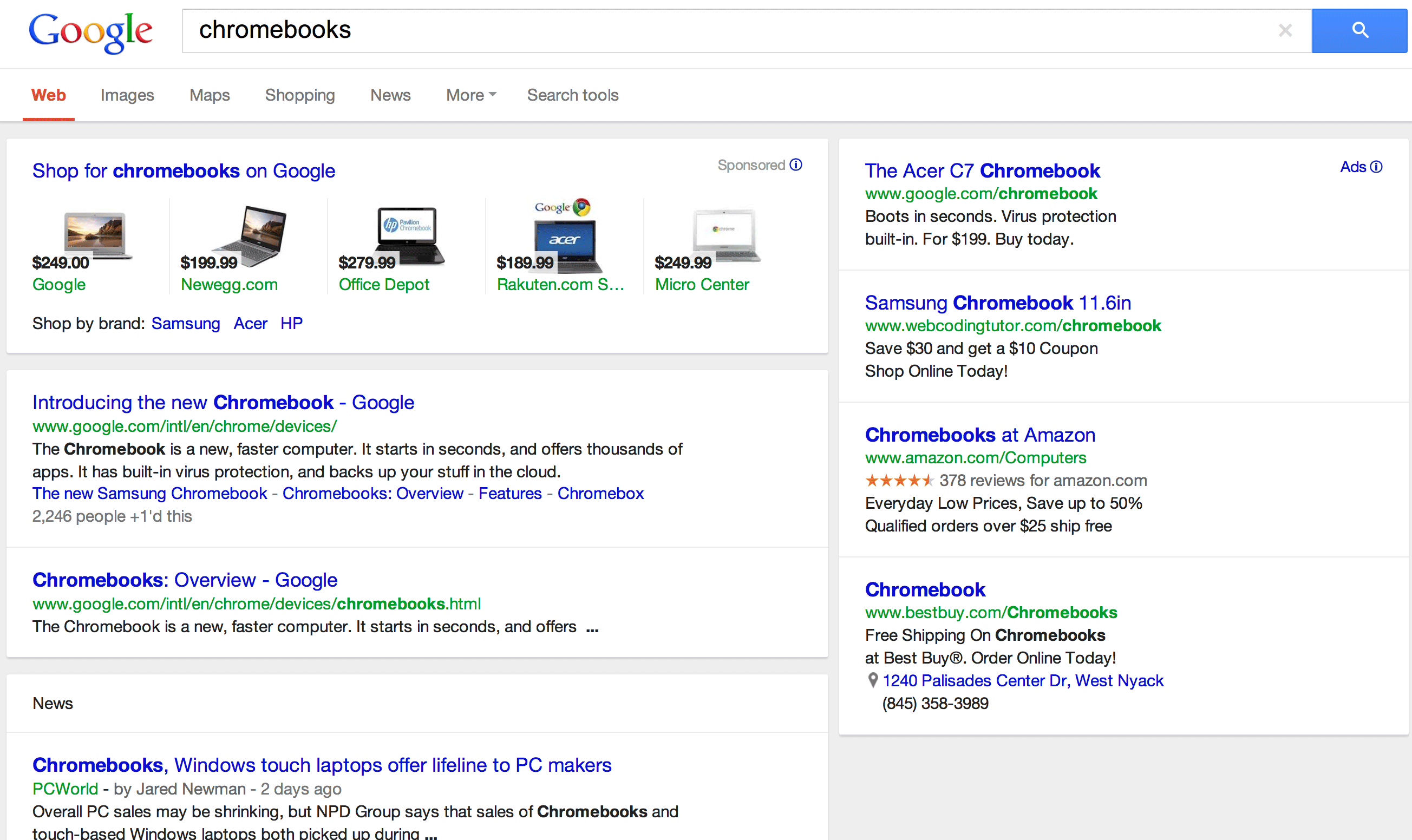
This has previously been introduced on Google+ and it’s also similar to Facebook’s recent timeline update. But now it seems to be the turn of the Google Search Results themselves. You can see a screenshot below of what the new Card Layout looks like on the iPad:
 I really quite like the new design. I’m also comfortable saying it’d work just as well and look just as nice on your computer. What do you think to the new Layout?